
Recently we’ve been helping clients convert more website visits into sales by making their online forms more user-friendly.
Analysing forms is important if you want to lift your conversion rate. We are using some of the latest technology to see what our clients’ website visitors are doing with their webforms and analysing this behaviour to identify where there are problems.
We can see which areas are causing users enough difficulty that they abandon the form and don’t come back. We can determine whether dropouts are being caused by usability issues such as drop-down menus that don’t work, unclear copy, unhelpful error messages or simple technical faults.
We’re looking at the following metrics and how they trend over time, especially in response to any changes in the form.
- Form Starter Rate
A low starter rate could suggest the form is too complicated and is scaring users off. Other common issues are that visitors can’t see the benefit in completing the form, the instructions are confusing, or the wrong audience is being driven to the form and they’re just not interested.
- Starter to Completion Rate
This metric tells us whether there’s a problem with the form itself. Visitors who are motivated to start but don’t complete the form must have been put off by something, so a declining starter to completion rate should raise a red flag.
- View to Completion Rate
This combines the previous two metrics and usually needs more segmentation to be useful. For example, a flat graph might suggest nothing much is happening, but further investigation may reveal that fewer visitors are starting the form, while more of those who do start are completing it – perhaps because you’ve improved the form, or you’ve weeded out the “time-wasters”.
We use these insights to amend forms where needed, eliminating the issues and improving the form’s completion rate. So, you gain more customers or leads without having to increase your marketing budget.
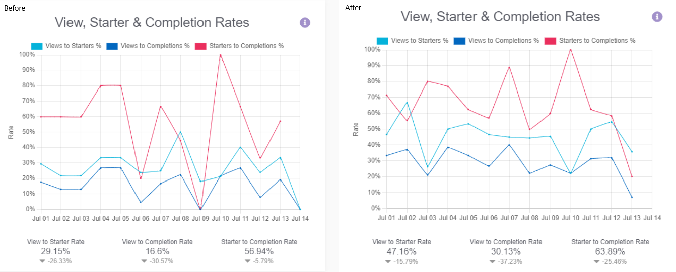
The graphs below show the impact of changes we made to one client’s online form. You can see a significant improvement across all three metrics: views to starters, views to completion, and starters to completion. Note how the new form has a slightly higher start to completion rate BUT a much higher view to completion rate – we made the form a lot less scary.
The greatest insights from a piece of form analysis almost always come from the field level data, which tells us which questions visitors are struggling with. We can see which fields have the greatest dropout rates and also track field returns, where a user comes back to a previously completed field to make a change. Generally, the more field returns, the more frustrations visitors have with a form, so it’s useful to see if this metric is growing, shrinking or staying the same.
Other useful metrics include:
- The time visitors spend completing the form – some forms naturally take longer to complete but a long average time warrants further analysis.
- Tracking error messages is a great way to understand where there may be usability issues with the form, as they are triggered by a visitor not being able to enter valid data into a field.
Finally, it’s wise to check whether the conclusions we draw from the data apply to your entire audience, or only to certain segments. For example, visitors who are driven to your site by paid advertising campaigns often behave very differently from those who come to your webform “organically” (by doing a Google search or typing in your URL).
If you’d like to improve your conversion rate, some analysis of your webform is a good place to start. We can guide you to do this yourself, run an impartial eye over your webform, or take care of the whole process, including data collection, analysis, form changes and testing.
Contact us today to learn more about this service.