
Have you ever dealt with a customer who has very specific needs but who has breezed into your store in such a hurry that they don’t have the time to hear your sales spiel or hang around while you find the best option for them? These customers can be hard to please because they just don’t have the time or attention span you need to help them to your best ability.
Websites have these same challenging visitors. Quite a few of them, actually. In fact, the number of “challenging” website visitors are growing.
Who are they?
Let me introduce you to your mobile audience. Yep, those who look at your website through a screen the size of their hand and in situations where their attention is fleeting and easily distracted – you’re often their entertainment tool while they wait for a bus, their coffee, a friend to arrive.
Your first task – and the easiest – is to find out how many of your visitors fit into this group using Google Analytics. Just head over to your “Audience” section and you will see “Mobile” as an option. Within there you will see two sections: “Overview” and “Devices”. 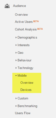
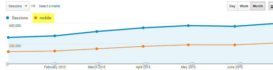
Overview gives you just that – a top level look at how this type of traffic compares to those arriving from a Tablet or a Desktop computer. This is where you can check the volume of mobile visitors and see if there are any trends. Have a look at the past six months to see if your number of mobile-using visitors is heading up or relatively flat. In April, Google updated its search algorithm to favour those websites designed to be mobile friendly in order to drive a better user experience for those viewing from a mobile device. Scan back to April to see if your mobile traffic has taken a dive since that change.
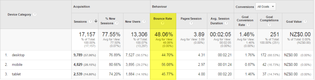
Next up, let’s check how all three sizes of screen (tablet, desktop and mobile phone) are coping with your website’s content. You can see this through looking at the “Bounce Rate” – remember, that’s the percentage of people who come to the website, look at one page and then leave. The lower this stat the better; ideally you want to hover between 20 to 40 per cent. The “Overview” section gives you the bounce rate percentages for all three screen groups. In an ideal world you want the three numbers to be the same – and low. But if your website is non-mobile friendly, it’s likely your results will show higher bounce rates as your visitors quickly give up trying to navigate a desktop website from a dinky screen.
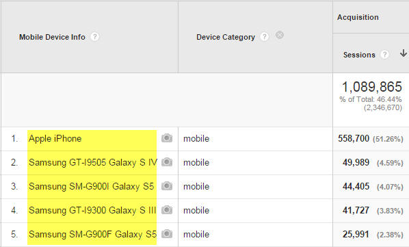
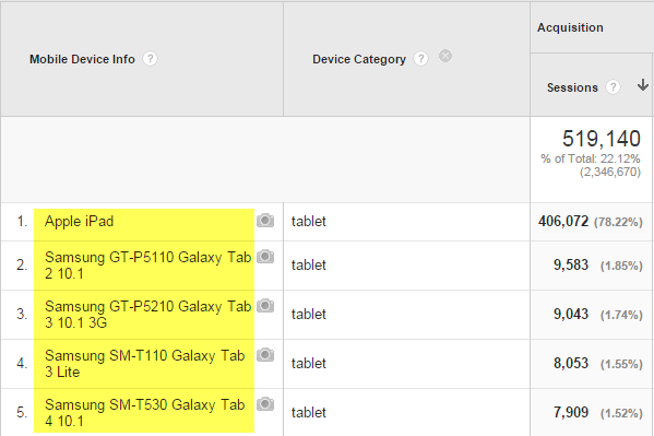
The “Devices” part of this report lists exactly that: the phone models your visitors are using. This is where you see the power of Apple’s marketing: iPhone is usually the majority of your phone traffic and iPad the majority for your tablet visitors.
Spending more time looking at your mobile visitors can help you solve problems such as:
- Reconsidering any online advertising that brings in a large amount of new mobile visitors as you now see these visitors are struggling to convert in your non mobile-friendly website.
- Fast tracking the implementation of your new mobile-friendly website as you notice an upward trend in mobile visitors (and a matching upward trend in their bounce rates).
- Ensuring that Google Analytics is incorporated within your new mobile app so you can get a similar level of tracking when your visitors engage here instead of your website.
Chris Price owns Ark Advance, a web optimisation business that specialises in online marketing. Ark Advance also offer a free monthly email newsletter focused on helping business owners grow their services online – sign up for free at www.arkadvance.com.
