You don’t have to be an interior designer to sell home improvement products, but learning a few design principles may help you and your team convert more leads into sales.
I’ve been talking with Auckland interior designer Gaye Adsett about the benefits of teaching showroom staff about colour and the principles and elements of design. Gaye owns Equilibrium Interiors and runs workshops to help retailers in design-related industries.
“If you can speak knowledgeably about elements of design, people will have confidence that you know what you’re talking about,” Gaye says.
Whether or not you’re in the market for some upskilling, you may find Gaye’s insights useful not only as you help your customers choose the right products for their home, but also in helping you create a showroom that exhibits the design knowledge you want to project.

Gaye begins with undertones, one of the most important principles to understand when dealing with colour. Every paint colour has undertones, such as yellow, green, pink, blue and more. These dictate what colours fit together, and if you have too many competing undertones in a room, it will look “off”.
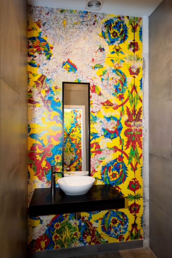
In addition to undertones, it’s worth considering where a colour sits on the colour wheel and its relationship to other colours in the room. When you add in luminosity, (whether a surface is shiny or matt), texture and pattern, there’s a lot to balance.
The rules are made to be broken, Gaye says, but you need to know what you’re doing.
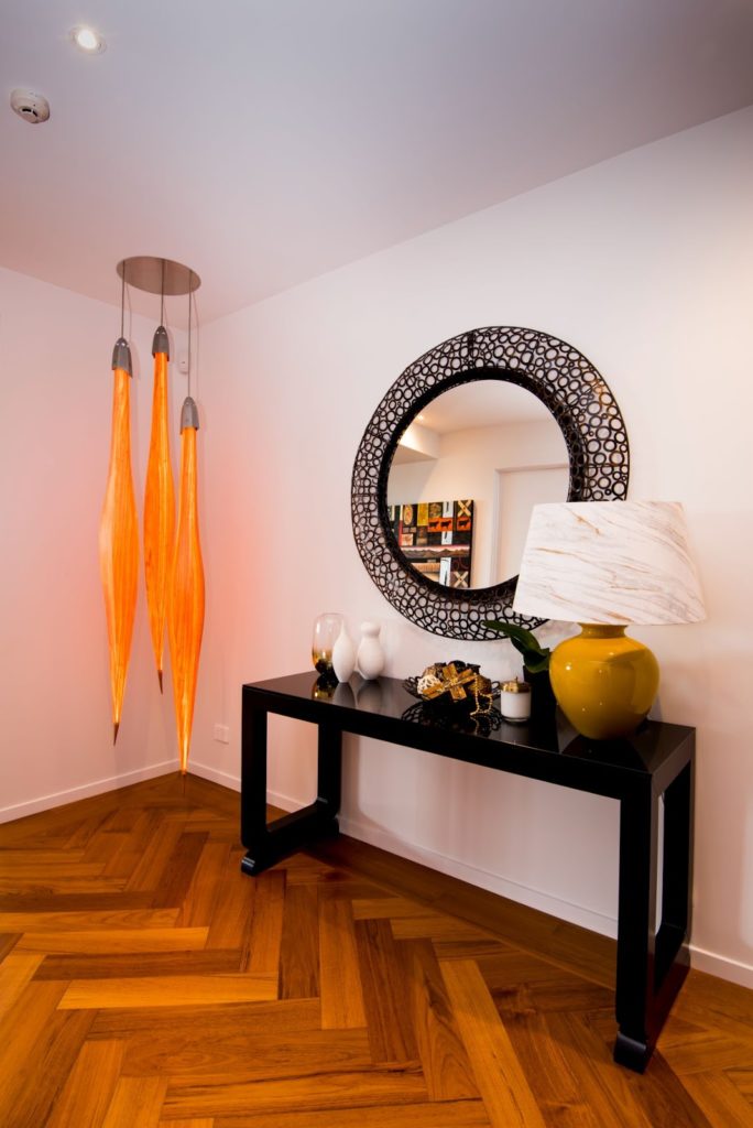
A useful guide is the two-thirds / one-third rule which can be applied to most elements of design including colour, style, texture and pattern. As an example, two-thirds of a space should be in one colour (usually the walls), and one-third in a second colour (such as the floor), with other colours used as accents, generally in the furnishings. But Gaye says she’s seen rooms all in white that have been stunning, thanks to the skillful use of luminosity, texture and pattern.
If a room is all windows and doors, the drapes will provide a huge proportion of the colour and the fabric may need to be more neutral to avoid dominating. Conversely, a striking colour or pattern may be just what’s needed to distract from an unpleasant view outside.

Too many hard surfaces can cause sound to bounce around a room, which is why in some cafés, where timber floors combine with glass cabinets and hard furniture, it’s impossible to hear yourself speak.
Keep the two-thirds rule in mind if mixing old and new furniture, for example. Avoid half and half of anything, as it will usually look confusing.
Every room should have a main focal point, with secondary points of interest adding to, rather than detracting from it. Gaye takes her cues from the role of the room: in the dining room, she makes the dining table the focal point; in the lounge it’s the seating area; and in the bedroom, the bed.
Gaye recalls a student who couldn’t resist a stunning fabric for the drapes in the master bedroom, and then wondered why she was disappointed when they were installed. The curtain fabric had drawn the focus away from the bed, which then needed ‘amping up’ to make the design work.

Contrast draws the eye, whether in colour or shape, which is why putting the TV cabinet on an angle will make the TV the focal point of the room. Gaye remembers visiting a tile showroom and being asked what she thought of the window display. Two tiled walls created an L-shaped alcove, with a bath installed on the diagonal drawing attention away from the tiles – not what the owners wanted!
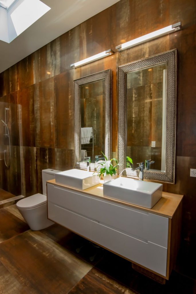
Vertical wall tiles are a popular trend in the bathroom and Gaye advises caution if the room has high ceilings. The horizontal line is the most peaceful aspect for our eyes to rest on, and vertical tiles will draw the eye up and can make a small room look like a vault.
Interior design trends are something every retailer needs to be on top of, and Gaye is a fan of some of the latest looks, such as black tapware. However, she cautions that every trend passes eventually, and this will probably be as true for black taps as it was for avocado baths.
Following trends enables you to not only give customers the most up-to-date choices, but also to be aware when a look has been done to death.
Gaye believes that the more knowledge retail staff have in design, the better they can help their customers, and the more likely they are to have happy customers and repeat business. If you’d like to contact Gaye about training for your staff, visit her website or call her on 021 529 133.
